If you’re an eCommerce business owner looking to enhance your online sales, there are many areas where you can look for improvements, and the whole endeavor of optimizing your ecommerce website is just a part of it. But you need to start somewhere, and the two potential options to begin with could be streamlining your checkout process, and optimizing product pages.
Optimizing, however, is such a broad word! What exactly should you be looking at? In this blog post, we talk about the key steps for optimizing your product pages.
Let’s start with the basics and definitions.
When we talk about eCommerce product page optimization, we mean practices and rules to enhance elements and features of a product page to maximize conversions and sales. It involves strategically improving various aspects of the page, including its content, design, layout, functionality, and more.
However, you should not just jump onto improvements without a goal in mind. You need to approach optimization from a strategic standpoint, and that means having specific goals in mind. Here are the two goals that are the most relevant for eCommerce page optimization:
1. Search Engine Optimization (SEO): Making the Store Attractive to Search Engines
The store might be perfect and the products high-quality, but what if no one can find them? Surviving is going to be tough in this case.
There are techniques to make your website easy to find and understand so that search engines such as Google and Bing rank it higher, thus making your store easier to find.
This effort is called SEO, and it’s goal is driving up organic (unpaid) traffic. You have quite certainly heard about it before, but there are SEO techniques that are specific for eCommerce.
2. UX (User Experience): Guiding Customers Through a Purchase Journey
Once you have attracted users to your eCommerce store, you need to provide a top-notch experience so the users are happy to browse your store, purchase from you, and even recommend you to others.
This is where UX optimization comes in, and it absolutely applies to product pages as well.
If you are getting the impression that all this means double work, don’t worry. Fortunately, many optimization tasks address both goals at once: Good UX practices will usually help with SEO.
As we mentioned, it’s super important to approach optimization strategically. And this is why we are providing the four optimization steps below in a form of experiments that you can run (and there are other tests to run that can also help you improve return on investment). For each step, we explain why it is important, what you need to do to achieve success, and what you should measure to understand if you are moving the needle. Now, let’s dive right into it!
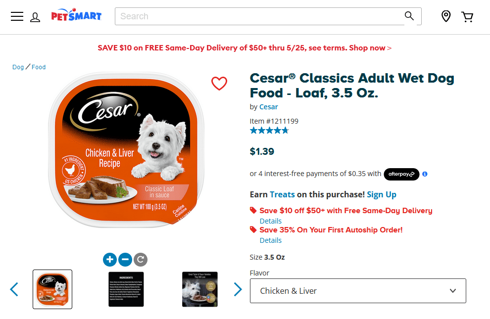
Example: PetSmart website’s product titles are informative and make it very clear what’s unique (brand, food type, and weight), making it very easy to make a quick purchasing decision without reading the rest of the product page. Source
Why it’s Important
If customers are not allured by the product title, they won’t click it, and won’t learn more about it. Description, photos, videos, attachments… every other optimization that you make wouldn’t have any effect. So, optimizing titles should be one of the top priorities.
Good titles help to improve the product’s visibility in search results, making it easier for potential customers to find it. It can also increase click-through rates and conversion rates.
What to Do and How
It can be tricky but try to point out what’s unique about your offer. This is especially true when the market is saturated. The differential might be quality, price, brand, or even service – be sure to highlight why customers should buy your product in particular.
On the SEO side, use relevant and high-volume keywords in the product title that accurately describe the product’s features and benefits. This is essential information, so make sure it’s properly tagged with a relevant h1 or h2 tag.
Also, keep the title short and sweet, with a maximum of around 60 characters, to make it easy to read.
Here’s a quick checklist for product titles optimization:
- The product titles are no more than 60 characters long.
- The product titles use relevant keywords.
- The product titles are visually highlighted, making it clear they are titles.
- The product title has an H1 or H2 tag (make sure to not have more than H1 on each page though).
How to Measure Success
Titles are usually located on top of the product page, a hot zone. If a user doesn’t get hooked, they won’t scroll down or may even leave.
You can use tools like Mouseflow to assess how much time users are spending on the page. The heatmap tool will help you understand if they are engaged about the whole content or simply skimming the top and leaving.
As for search engines, track the rankings for the targeted keywords and experiment with different combinations to see if the product is appearing higher in search results. Don’t hesitate to also monitor what the competition is doing.
Why it’s Important
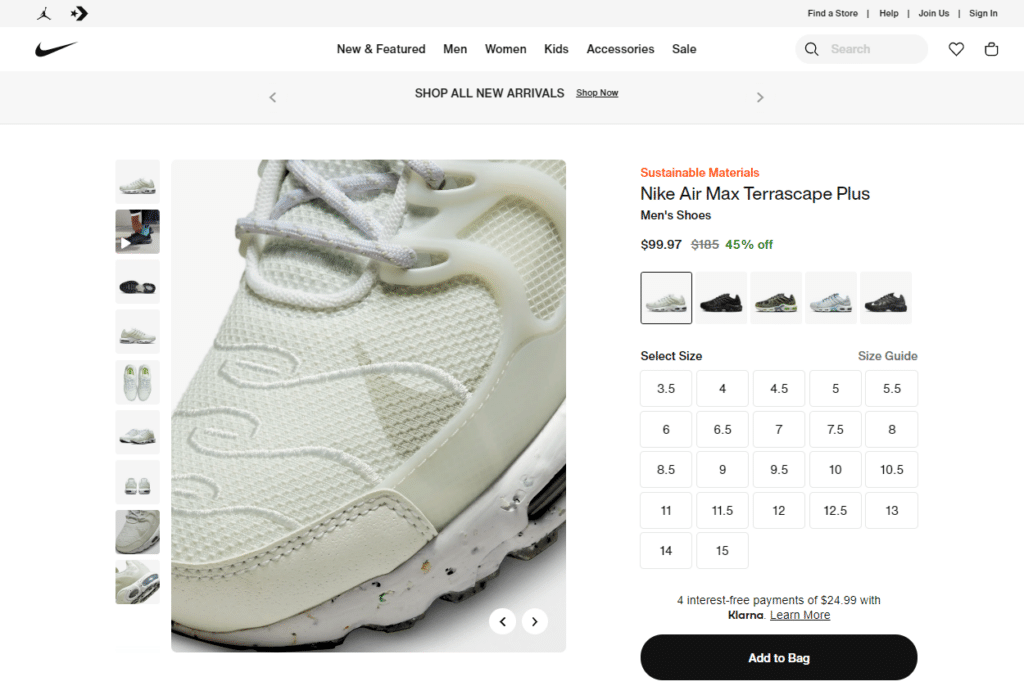
Understanding images is much easier and quicker than reading text. Products with appealing images build trust. Plus, images are an easy way to showcase features and benefits, increasing the likelihood of a purchase.
It might sound obvious to suggest using images in industries such as retail, but don’t forget the “high quality” part.
What to Do and How
Images should always look sharp, even when zoomed in. Blurriness conveys a sloppy experience. Be sure to test the website on different devices to ensure the experience is uniform.
On the technical side, compress the image files to reduce loading times and consider using a CDN (Content Delivery Network) to deliver the images quickly across different regions.
Here’s a quick checklist of product gallery best practices:
- The product gallery features various images.
- The product gallery has at least one video.
- The images are high quality and appealing.
- Image zoom is easily accessible on both desktop and mobile.
- The navigation between images is easy and supports swipe gestures.
- The images are optimized for web and load quickly.
How to Measure Success
Monitor the engagement rate (ER) for the product page, including the bounce rate, time on the page, and the number of product images viewed.
You can track the conversion rate (CR) of specific images to see if high-quality images lead to an increase in purchases.
As an experiment, you can try adding different images and assessing which ones drive more clicks. Note that they should be always in the same position for a valid test, as privileged spots (like the first in a gallery) naturally get more clicks.
Why it’s Important
The product description is the section with the most potential on eCommerce pages. It’s not as constrained as the title and still is hot – customers want to learn more about the offer.
Detailed product descriptions help to provide the customer with a comprehensive understanding of the product’s features and benefits. If it resonates with the customers, it will be the key factor leading to a purchase.
Additionally, when descriptions are clear, they reduce the likelihood of product returns and increase customer satisfaction. This is because the customer becomes well aware of what exactly they are buying.
What to Do and How
You should balance descriptive language (what a product is) with the appeal (why should the customer buy it).
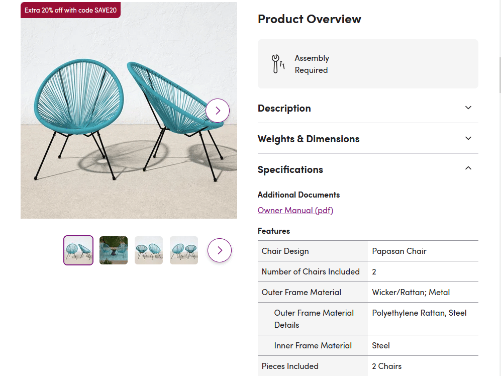
Descriptive language should be easy to understand and include clear, relevant details such as materials, dimensions, and instructions of use. The appeal is more subjective and will depend on your niche and your customer.
For example, a seasoned plumber buying a pipe only cares about price and specifications; a bored millennial shopping for t-shirts needs reasons beyond fabric type.
On the technical side, keywords are important, but don’t get too carried away by them. Keyword stuffing (overusing them repeatedly) is obvious to search engines (which would result in lowering your positions in organic search) and obnoxious to human readers.
Also consider the user’s device – longer texts work better on a computer, and bullet points can make the information easier to read, especially on mobile.
One tip: there are many non-obvious opportunities to add keywords conveniently and helpfully. For example, in a FAQ (Frequently Asked Questions).
Here’s a quick checklist for product descriptions:
- The product description is easy to quickly scan.
- The product description emphasizes the benefits of the product.
- The product description includes a table with technical specifications.
- The product description talks to the customer in their language.
- The product description includes an FAQ section.
How to Measure Success
Monitor the ER for the product page, including the bounce rate and time on the page.
Heatmaps are also an ally. An overall green description will mean that the copy is working and keeping customers engaged. If you have orange or red, it’s time to rethink the approach.
And the best way to understand what the visitor thinks of the page is to ask them! You can use Mouseflow’s feedback tool to collect their impressions at key moments.
Why it’s Important
Reviews and ratings from previous customers can be a gold mine, providing social proof that the product is high quality and worth purchasing. They can also increase overall trust and confidence in the brand.
What to Do and How
To start with, collect reviews and ratings as early as possible. There are many tactics, such as sending follow-up emails to customers after their purchase, asking for a review and offering incentives such as discounts or free shipping.
Remember to collect names, photos, and professions, if that’s relevant. Every happy customer can bring more customers.
The product page should display reviews and ratings prominently, in hot zones, such as the top of the page or near the purchase button.
If you get a lot of reviews for each product, consider using AI to distill key highlights, like Newegg.com does with it’s so-called Review Bytes. This way it’s not necessary for the prospect to go through many reviews to understand what most reviewers highlight as pros and cons of the product.
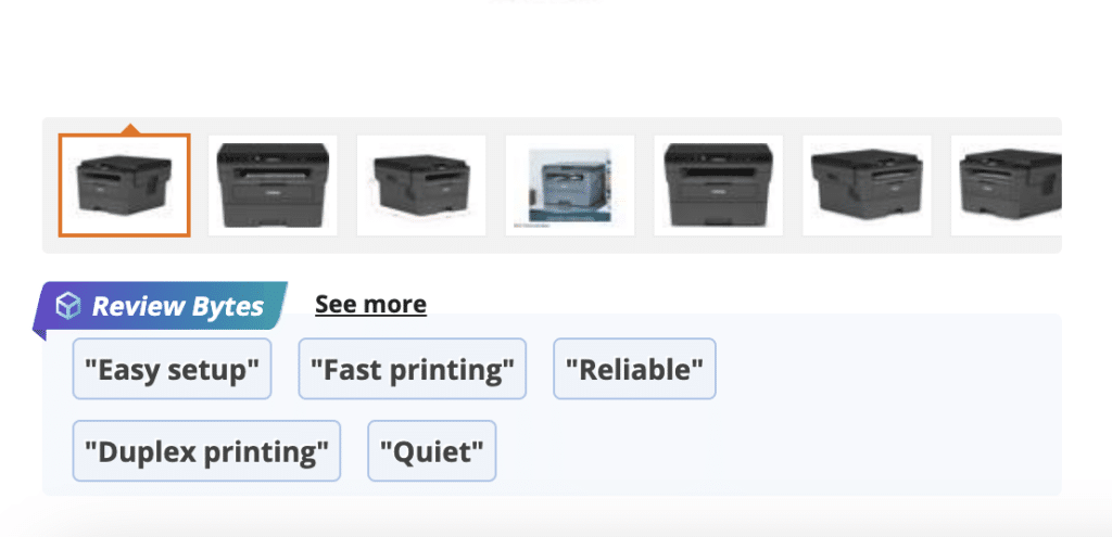
Retailer Newegg relies on AI to go through customer reviews and generate key highlights that many of them mention.
Here’s a quick checklist for displaying social proof on a product page:
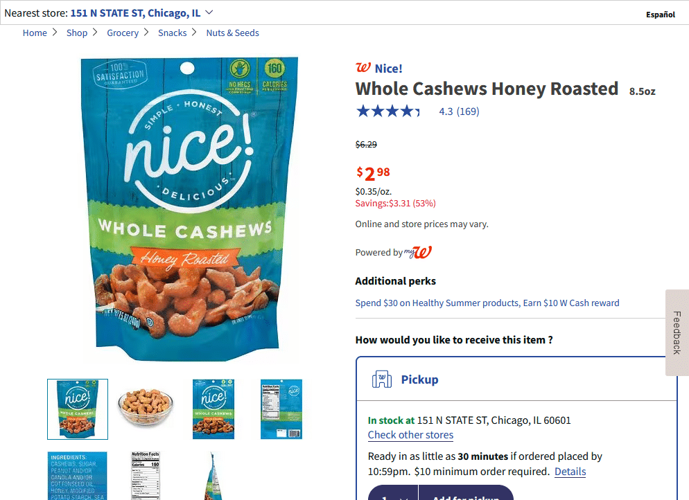
- Product ratings are displayed near product titles and link to the reviews sections.
- Customer reviews include title, customer photos of the product, star rating, and reviewer’s name.
- The product page displays the number of products sold during a certain period of time (like “sold 15 times this month”).
How to Measure Success
Track the number of reviews and ratings received for the product. Monitor the engagement rate (ER) for the product page, including the bounce rate, time on the page, and the number of reviews and ratings viewed.
As the number of reviews grows, track the conversion rate of a product to see if there’s any relation.
A possible test: compare the CR of two similar products – one with reviews and one without – over a set period.
eCommerce product page optimization can seem daunting at first, since it involves so many areas: content, design, and technical website maintenance.
But it’s useful to think of it this way: you are making it easier and more pleasant for the customer. An optimized store will attract more people and guide them efficiently through the purchase journey.
Being disciplined about optimizing your eCommerce business is a step in outranking the competition, attracting more potential customers, driving sales, and ultimately maximizing online revenue.

